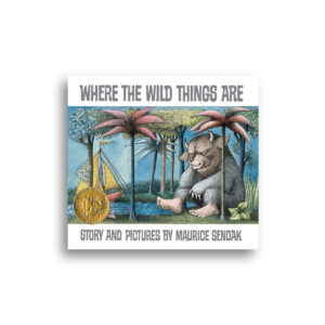
Despite the old adage, judging a book by its cover is a major part of the book shopping experience (and always has been). Humans are visual creatures, and we intake information quickly and often subconsciously. No matter how excellent the inner contents of your book, without an attention-grabbing and clearly communicated cover design, book buyers will have a hard time fully connecting to your book before they “add to cart.” Fantastic design is an investment in your book’s marketing and its ability to reach the entire potential audience that exists for your words.
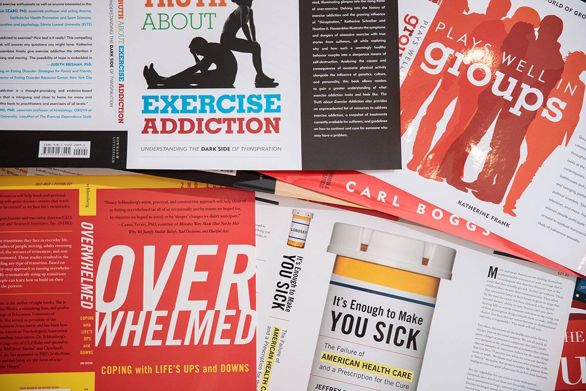
As a professional book cover designer of over a decade, I’ve seen exactly what elements help make a cover stand out from the rest of the shelf. Read on for my five must-haves for a best selling book cover design.
1. A Memorable Title
A powerful title will instantly distill the feeling of your book within your reader’s mind, giving them a strong sense both of your subject matter and the overall mood and tone your book will set. Titles should be quick, easy to read, and instantly impactful — some great examples of strong titles are below:
- Bad Blood by John Carreyrou, a nonfiction novel about the downfall of Silicon Valley medical start-up Theranos
- The Immortal Life of Henrietta Lacks by Rebecca Skloot, a 2011 biography about a woman’s whose cells were used without her consent for years of medical discovery
- Terror in the City of Champions by Tom Stanton, a recounting of Detroit’s championship baseball victories set against the backdrop of domestic terrorism in the 1930s (also one of my cover designs!)
Each of these titles are short and memorable — they excite, entice, and send a message about their books’ contents efficiently and in style.
When it comes to design, the title should be the primary focus of your book’s cover and must be easy to decipher and understand quickly. It should also keep mobile shoppers and e-readers in mind: great contrast and large type will help your cover stand out while your reader is scrolling on Amazon or iTunes.

2. A Descriptive—But Still Engaging—Subtitle
Your subtitle is another fantastic way to pique your reader’s interest in your subject matter. To use an example from before, Tom Stanton’s Terror in the City of Champions features the subtitle Murder, Baseball, and the Secret Society That Shocked Depression-Era Detroit. Enticing, right? Subtitles can be lengthier than your main title, but should still have rhythm and hit on the major points of your book’s mood and feel. For design, your subtitle should be legible, too, and should complement the overall look of your title and other design elements — like images or illustrations.
3. On Tone Typography
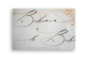
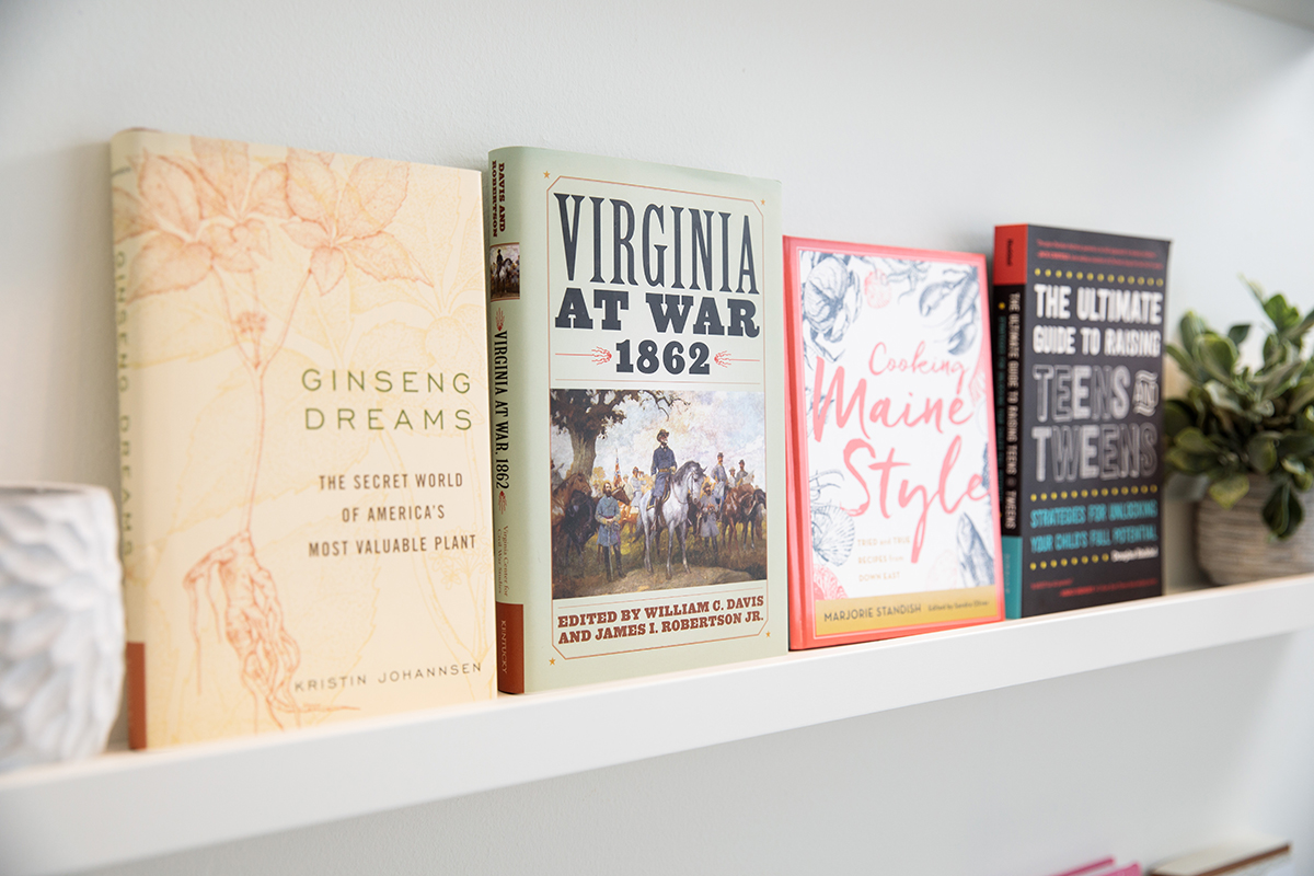
Typography is my favorite element of cover design. Great type has the ability to communicate tone, era, subject matter, and overall style in an instant, and should be used judiciously to make a major impact on your reader. Here are a few examples of my favorite type selections:
As I noted with the previous two must-haves, legibility is ultimately just as important as style in typesetting. The overall color palette and sizing has to be readable from a distance away — whether your customer is perusing the shelves of their local bookstore or clicking through the pages of an online retailer.
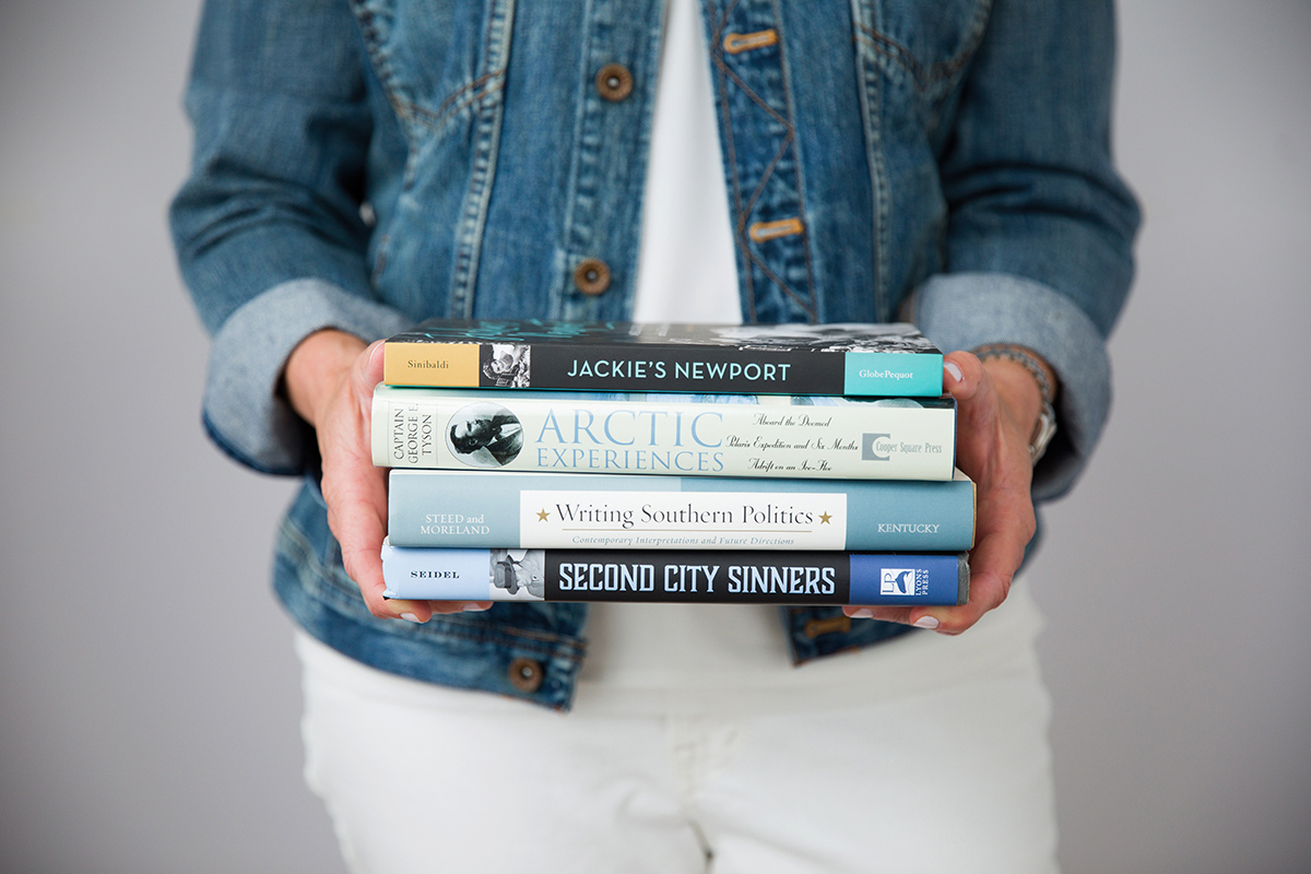
4. A Spine with Style
Every part of a cover is important real estate — but especially the spine! Most books sit spine out on the shelf, so an enticing spine design has major potential to grab a browsing reader’s eye. It’s important that the spine also complements the front and back cover designs, and that any typography is very legible and well-contrasted so it’s easy to decipher even from a few feet away. I also love incorporating imagery into spine designs — it’s another fantastic way to make your cover stand out from the shelf.

5. Fantastic Blurbs
A great cover blurb is worth 1,000 (praise-filled) words. Much like an incredible review of a local restaurant in the paper or five-star accolades for a pair of jeans you found online shopping, blurbs are social proof. They signal to shoppers that an author or public figure they love — or perhaps just someone who appreciates the same subject matter — values what’s inside your book. Building this type of credibility with your audience right away is a fantastic use of cover space, and your designer can help determine the best jacket placement for all of that praise.
While these design elements don’t cover (pun intended!) every intricate detail of book cover design, they set an excellent foundation for any author or publisher looking to design a cover that makes an impression on readers before they’ve even cracked the first page of their book. If you’re looking to work with a professional to design the most interesting and impactful cover possible for your book, I’d love to be of service! To see more of my portfolio, and to send me an inquiry please fill out my form.


